Fonts. We see them everywhere, every day. From the sleek, modern lines of a website to the comforting curves of a book’s text, they’re so ubiquitous we rarely give them a second thought. But behind every serif, every sans-serif, every carefully crafted curve lies a history far more complex – and surprisingly political – than you might imagine. This article delves into the fascinating story of how fonts have been used, manipulated, and even suppressed throughout history, revealing how they’ve been inextricably linked to power, ideology, and social change.
The Early Days: From Hand-Lettering to Movable Type
Before the advent of digital fonts, there was calligraphy. For centuries, skilled scribes meticulously hand-lettered documents, each stroke reflecting the artistry and status of the writer. In the medieval period, specific scripts – like Carolingian minuscule – were deliberately standardized by Charlemagne to promote literacy and unify his empire. This wasn’t merely about readability; it was about control. A standardized script meant standardized information, easily disseminated and understood across vast territories. The very act of choosing a script carried weight – it signaled authority and legitimacy.
The true revolution, however, came with Johannes Gutenberg’s invention of movable type in the mid-15th century. This wasn’t simply a technological advancement; it was a democratizing force. Suddenly, mass production of texts became possible, breaking the Church and aristocracy’s monopoly on knowledge. Gutenberg’s initial typeface, known as Textura, closely mimicked the Gothic scripts of the time, reflecting the prevailing aesthetic and religious sensibilities. But even this early choice wasn’t neutral. Textura, with its dense, blackletter appearance, evoked a sense of tradition and authority, reinforcing the established order, even as the technology itself threatened it.
The Renaissance & The Rise of Humanism
The Renaissance witnessed a deliberate shift away from the Gothic styles of the Middle Ages. Humanist scholars, rediscovering the classical texts of Greece and Rome, sought a typeface that reflected the clarity, balance, and rationality of classical thought. This led to the development of Roman typefaces, inspired by the inscriptions found on ancient Roman monuments. Niccolò Niccoli and Francesco Petrarca, key figures in the humanist movement, actively commissioned the design of new, more legible scripts.
Venetian printers, like Aldus Manutius, played a crucial role in refining these Roman types. Manutius’s typeface, often referred to as Aldine Roman, was characterized by its elegant proportions, clarity, and relatively compact size. This allowed for the production of smaller, more affordable books, further expanding access to knowledge. The very *shape* of the letters – rounder, more open, less imposing than the Gothic scripts – communicated a new emphasis on human reason and individual expression. The Renaissance wasn’t just about rediscovering classical texts; it was about embodying classical ideals in the very form of those texts.
The 18th & 19th Centuries: Nationalism, Industrialization & Typeface Proliferation
The 18th and 19th centuries saw an explosion in typeface design, driven by the forces of nationalism, industrialization, and increasing literacy. As nations began to forge their own distinct identities, fonts became tools for expressing national character. For example, the development of *Fraktur* in Germany, a highly ornate blackletter style, was deliberately promoted as a symbol of German cultural identity, a rejection of the perceived “foreignness” of Roman typefaces. This wasn’t simply about aesthetics; it was about defining what it meant to be German.
Industrialization brought with it the need for standardized, mass-produced typefaces. The rise of advertising and printing technologies demanded fonts that were both legible and visually striking. Figures like Robert Thorne and William Caslon IV created typefaces that were designed to be used in a variety of contexts, from newspapers and books to posters and advertisements. The emergence of the sans-serif typeface – initially seen as somewhat radical – reflected a growing preference for simplicity and modernity, mirroring the aesthetic of the Industrial Revolution.
However, even the seemingly neutral sans-serif wasn’t immune to political undertones. In the early 20th century, the Bauhaus school in Germany embraced sans-serif typefaces as a symbol of their commitment to functionalism and social reform. They believed that a clean, uncluttered aesthetic could contribute to a more rational and equitable society.
The 20th Century: Propaganda, Modernism & Corporate Identity
The 20th century witnessed the most overt manipulation of fonts for political purposes. Totalitarian regimes, like Nazi Germany and the Soviet Union, understood the power of typography to shape public opinion. The Nazis, for instance, favored bold, heavy blackletter typefaces (like *Sutterschrift*) for official propaganda, evoking a sense of strength, tradition, and nationalistic fervor. They actively suppressed fonts associated with Jewish or socialist movements, effectively censoring dissenting voices through typography.
In contrast, modernist movements, like Constructivism in Russia and De Stijl in the Netherlands, embraced geometric sans-serif typefaces as symbols of progress, technology, and a utopian future. These fonts, with their clean lines and rational forms, were seen as representing a break from the past and a commitment to a new social order.
The post-war era saw the rise of corporate identity and the use of fonts to create distinct brand images. Companies began to commission custom typefaces to differentiate themselves from their competitors. Helvetica, designed in 1957, became particularly iconic, embodying a sense of neutrality, efficiency, and modernity. Its widespread adoption by corporations and government agencies reflected a desire for a clean, authoritative image. However, even Helvetica’s perceived neutrality has been questioned, with some arguing that its ubiquity has inadvertently contributed to a sense of standardization and homogenization.
The Digital Age: Democratization & New Forms of Control
The advent of digital typography in the late 20th and early 21st centuries brought about another revolution. Suddenly, designers had access to a vast library of fonts, and the cost of creating and distributing typefaces plummeted. This democratization of typography empowered individuals and small businesses, allowing them to express their creativity and establish their own unique identities.
However, the digital age also introduced new forms of control. Software licenses restrict the use and modification of fonts, and the dominance of a few large font foundries raises concerns about monopolization and a lack of diversity. Furthermore, the algorithms that power web browsers and operating systems can influence the way fonts are displayed, potentially altering the intended meaning or aesthetic impact of a text.
The rise of variable fonts – fonts that allow designers to adjust parameters like weight, width, and slant – represents a significant development in digital typography. Variable fonts offer greater flexibility and efficiency, but also raise questions about the potential for algorithmic bias and the erosion of typographic consistency.
Fonts & Social Movements
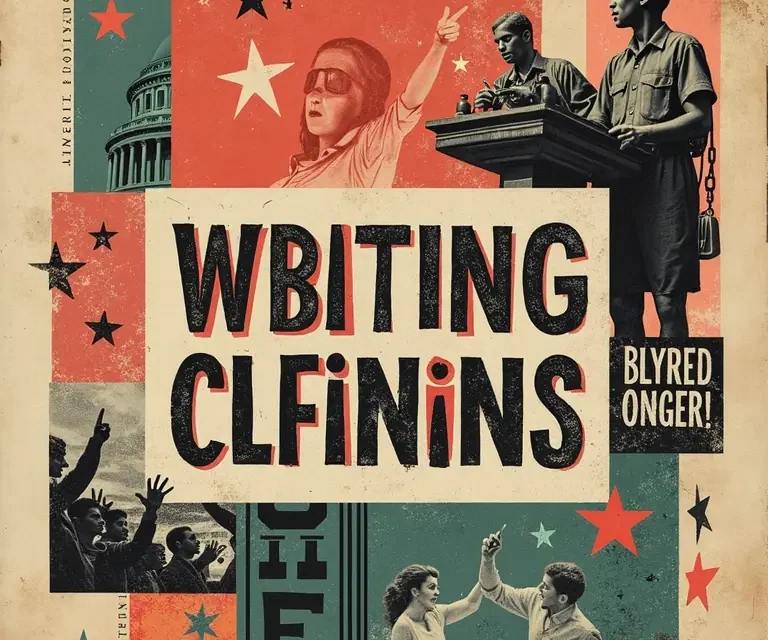
Fonts have often been adopted, and even *created*, in support of social movements. The feminist movement of the 1970s saw a rejection of traditional, “masculine” typefaces in favor of softer, more organic designs that celebrated female aesthetics. More recently, the Black Lives Matter movement has seen the use of bold, impactful typefaces in protest posters and online graphics, conveying a sense of urgency and solidarity.
The LGBTQ+ community has also utilized typography to express identity and challenge norms, often employing playful, expressive fonts that reject traditional gender binaries. These examples demonstrate that fonts aren’t merely passive vehicles for communication; they can be active agents of social change.
The Ongoing Political Landscape of Typography
The political history of fonts is far from over. Today, concerns about accessibility, inclusivity, and cultural appropriation are shaping the design and use of typefaces. Designers are increasingly aware of the need to create fonts that are legible for people with visual impairments, and to avoid perpetuating harmful stereotypes through typographic choices. The debate over the use of culturally specific scripts and the ethical implications of font licensing continue to rage on.
Moreover, the rise of artificial intelligence and machine learning is poised to transform the field of typography in profound ways. AI-powered font generation tools could potentially democratize typeface design even further, but also raise concerns about originality, authorship, and the potential for algorithmic bias.
Conclusion: Reading Between the Lines
From the standardized scripts of Charlemagne to the propaganda typefaces of Nazi Germany, fonts have consistently been used as tools of power, ideology, and social control. However, they’ve also been instruments of liberation, creativity, and social change. Understanding the political history of fonts allows us to “read between the lines” – to recognize the subtle ways in which typography shapes our perceptions, influences our beliefs, and ultimately, impacts our world. Next time you encounter a typeface, remember that it’s not just a pretty arrangement of curves and lines; it’s a product of history, a reflection of culture, and a potential agent of change.
Interested in other hidden histories? Explore the fascinating world of tea leaf reading, or discover the surprising origins of nursery rhymes. For a look at the seemingly simple world around us, dive into the curious physics of bubbles, or consider the history of time zones. And if you’re intrigued by the power of the mind, check out the curious case of the placebo effect.

 The Curious Acoustics of Historical Echo Chambers: Resonance, Ritual, and Revelation
  The Curious Cartography of Scent: Mapping Perfume Ingredients Through History
  The Curious Lexicon of Lost Trades
  The Surprisingly Consistent Science of Historical Ice Harvesting – A Frozen History of Commerce & Preservation
  The Unexpectedly Consistent Science of Historical Buttonhooks – Fashion, Function & Forgotten Tools
  The Surprisingly Consistent Science of Historical Toy Soldiers – Miniature Warfare, Materials & Collective Play