For centuries, maps have served as windows into the unknown, charting territories, guiding explorers, and shaping our understanding of the world. But beyond the lines representing coastlines and rivers, lies a fascinating and often overlooked element: the map legend. These symbolic keys, seemingly arbitrary at first glance, reveal a surprising degree of consistency across cultures and time periods. This article delves into the surprisingly stable principles governing early map legends, exploring how cartographers communicated complex information through a shared visual language, even before widespread literacy or standardized conventions. We’ll journey from medieval portolan charts to Renaissance world maps, uncovering the logic behind the symbols and the stories they tell.
The Pre-Literate Roots of Visual Communication
Before the advent of widespread literacy, visual communication was paramount. Early humans relied on pictograms, ideograms, and other visual cues to convey information about their surroundings. This inherent need to represent the world visually laid the foundation for map legends. Think of prehistoric cave paintings – they aren’t just artistic expressions; they’re early forms of spatial storytelling, depicting hunting grounds, animal migrations, and perhaps even rudimentary maps of territory. This deeply ingrained reliance on visual cues carried over into cartography.
The earliest maps, often etched onto clay tablets or inscribed on stone, were less about precise geographical representation and more about conceptualizing relationships between places. These weren’t meant to be scaled, accurate depictions; they were mnemonic devices, helping people remember important locations and routes. The symbols used weren’t necessarily “accurate” representations of features, but rather evocative markers that triggered recall within a shared cultural understanding. For instance, a stylized mountain range might simply represent the ‘difficult journey’ to a particular region, rather than a precise topographical rendering.
Portolan Charts and the Rise of Maritime Symbolism
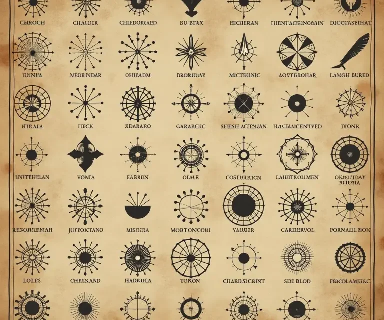
The portolan charts of the medieval Mediterranean (roughly 13th-15th centuries) represent a significant step toward more practical cartography. These charts, renowned for their network of rhumb lines radiating from compass roses, were focused on navigation and focused on coastal features. The legends on portolan charts, while often limited in scope, demonstrate a remarkable consistency in how certain features were depicted.
Cities were almost universally represented by clusters of buildings, often stylized and disproportionately large compared to the surrounding landscape. These weren’t meant to be realistic renderings, but rather indicators of importance and population. Rivers were typically depicted as winding blue lines, sometimes widening to represent estuaries or major waterways. Islands were often shown as small, circular or oval shapes. But the real innovation lay in the depiction of hazards.
Rocks and shoals, critical dangers for sailors, were frequently represented by stylized depictions of teeth or claws – visually suggesting the ‘biting’ danger they posed. Winds were often indicated by small faces blowing in the direction of the prevailing breeze. These weren’t arbitrary choices; they were rooted in a shared understanding of the dangers of the sea and a desire to communicate those dangers effectively. The need for clarity and immediate recognition outweighed any desire for artistic subtlety.
Renaissance World Maps and the Standardization of Symbols
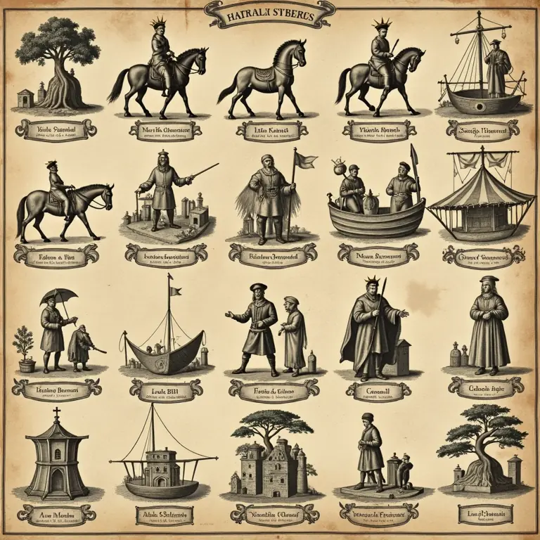
The Renaissance saw a surge in exploration and a corresponding explosion in cartographic knowledge. World maps, such as those produced by Martin Waldseemüller and Gerard Mercator, attempted to encompass the entire known world. This required a more sophisticated system of symbolism to represent a wider range of features. While still influenced by medieval traditions, Renaissance map legends began to exhibit a greater degree of standardization.
Mountains, for example, became increasingly represented by stylized ranges of peaks, often shaded to indicate elevation. Forests were depicted as clusters of trees, sometimes differentiated by type (e.g., coniferous vs. deciduous). Deserts were often shown as areas of sparsely populated terrain, sometimes with depictions of camels or other desert animals. The consistent use of these symbols across different maps facilitated understanding and allowed cartographers to build upon each other’s work.
However, it’s important to note that standardization wasn’t complete. Different cartographic schools and individual mapmakers often employed their own variations. For example, the depiction of settlements could range from simple clusters of buildings to detailed cityscapes, depending on the mapmaker’s style and the intended audience. The level of detail also varied considerably. Some maps focused on broad geographical features, while others attempted to depict specific landmarks and settlements.
The Influence of Classical Tradition and Mythological Creatures
Renaissance cartographers were heavily influenced by classical Greek and Roman texts. This influence extended to the symbolism used on maps. Mythological creatures, drawn from classical mythology, were often used to represent unknown or dangerous regions. Sea monsters, for example, populated the oceans on many early world maps, serving as warnings to sailors about the perils of uncharted waters.
These creatures weren’t necessarily believed to be real; rather, they served as placeholders for the unknown. They represented the dangers and uncertainties of exploration, and their presence reinforced the idea that the world was still full of mysteries. The use of classical motifs also lent maps a sense of authority and legitimacy, drawing upon the intellectual heritage of the ancient world. Consider the depictions of winds, frequently personified as cherubic faces or fierce gods, a direct link to classical representations of Aeolus and other wind deities. This blending of observation, imagination, and classical learning is a hallmark of Renaissance cartography.
The Role of Color and Shading
Color and shading played a crucial role in early map legends, supplementing the symbolic representation of features. Blue was almost universally used to represent water, reflecting its visual prominence and its importance for navigation. Green was typically used to indicate land, particularly fertile regions and forests. Brown or beige was often used to represent mountains and arid regions.
Shading was used to indicate elevation, with darker shades representing higher altitudes. Different colors were also used to delineate political boundaries or to indicate the presence of different cultures or empires. While the specific color palettes varied, the underlying principles remained consistent. Color wasn’t simply aesthetic; it was a functional tool for conveying information and enhancing the map’s readability.
Consistency Despite Cultural Differences
One of the most remarkable aspects of early map legends is the degree of consistency observed *across* different cultures. While there were certainly regional variations, the fundamental principles of visual communication remained surprisingly stable. For example, the use of clusters of buildings to represent cities was common in both European and Asian maps. The depiction of mountains as stylized ranges of peaks was also widespread.
This suggests that there was a universal cognitive basis for how people perceived and represented spatial information. Regardless of their cultural background, people tended to use similar visual cues to convey information about the world around them. This isn’t to say that all maps were identical, but rather that there was a shared underlying logic that guided the development of map legends. Exploring the origins of these patterns can be surprisingly similar to the patterns found in other traditionally crafted mediums, such as traditional quilting, where shared visual language communicated stories and cultural meaning.
The Evolution of Map Legends and the Impact of Printing
The invention of printing in the 15th century had a profound impact on cartography. Printing allowed for the mass production of maps, which led to a greater degree of standardization in map legends. As maps became more widely available, the need for clear and unambiguous symbolism became more pressing. Cartographers began to adopt more formalized conventions, and the use of written explanations in map legends became more common.
However, even with the advent of printing, the legacy of pre-printing traditions remained. Many of the symbols and conventions that had developed over centuries continued to be used, albeit in a more refined and standardized form. The printing press didn’t erase the past; it built upon it, creating a more coherent and accessible system of cartographic communication.
The Psychology of Map Symbols: Why These Choices Worked
The success of early map legends wasn’t simply a matter of convention; it was also rooted in the psychology of visual perception. The symbols used were often chosen because they were easily recognizable and memorable. They tapped into pre-existing mental schemas and evoked strong associations. For example, the depiction of rocks as teeth or claws directly linked the visual image to the feeling of danger.
Furthermore, the use of stylized symbols allowed cartographers to convey a great deal of information in a limited space. A small, stylized representation of a mountain range could communicate the idea of difficult terrain and potential obstacles, without requiring a detailed topographical rendering. The brain is remarkably adept at filling in the gaps and interpreting ambiguous visual cues, and early cartographers exploited this ability to create effective and informative maps. This inherent ability of the brain to interpret and sometimes *misinterpret* visual cues is explored in detail in the science of optical illusions.
Beyond Geography: Parallels in Other Symbolic Systems
The principles underlying early map legends aren’t unique to cartography. Similar patterns can be observed in other symbolic systems, such as heraldry, alchemy, and religious iconography. These systems all rely on a shared visual language to convey complex ideas and beliefs. The consistent use of certain symbols across different domains suggests that there are underlying cognitive principles that govern how humans create and interpret symbols.
For example, the use of lions to represent courage and strength is common in both heraldry and religious iconography. The use of circles to represent wholeness and perfection is prevalent in both alchemy and Eastern philosophies. These recurring motifs suggest that there are universal archetypes that resonate with the human psyche. Understanding these archetypes can provide insights into the meaning and significance of early map legends.
The Enduring Legacy of Early Map Legends
While modern maps rely on increasingly sophisticated technologies and standardized conventions, the legacy of early map legends continues to shape our understanding of the world. The principles of visual communication that were developed centuries ago remain relevant today. The need for clarity, simplicity, and memorability is as important now as it was then.
Furthermore, the study of early map legends provides valuable insights into the history of cartography, the evolution of visual culture, and the cognitive processes that underlie human perception. By decoding the symbols of exploration, we can gain a deeper appreciation for the ingenuity and artistry of early cartographers, and for the enduring power of visual communication. The meticulous attention to detail in historical measurements, from fabric to land, reveals a similar commitment to precision, as seen in historical weights and measures.
The Future of Map Legend Studies
Ongoing research in the field of cartography continues to reveal new insights into the history and evolution of map legends. Digital tools and databases are being used to analyze large collections of historical maps, identifying patterns and trends that were previously difficult to discern. Researchers are also exploring the cognitive and psychological factors that influence how people interpret map symbols.
Furthermore, there is a growing interest in the use of artificial intelligence to automatically decode and interpret historical map legends. AI algorithms can be trained to recognize and classify symbols, providing a powerful tool for historical research. The intersection of cartography, cognitive science, and artificial intelligence promises to unlock even more secrets of the past. The consistent logic behind these systems extends to other aspects of societal structure, like early road sign systems, designed for clear communication.
Finally, understanding how our ancestors perceived and represented the world is crucial for appreciating the evolution of our own understanding. Early map legends aren’t just historical artifacts; they’re windows into the minds of those who came before us, offering a glimpse into their hopes, fears, and aspirations. The study of these legends reminds us that maps are not merely objective representations of reality, but rather subjective interpretations shaped by culture, technology, and human imagination. And like tracing a family tree, understanding the origins of common names provides another layer of connection to the past – as explored in the study of last names.

 The Curious Cartography of Dreams: Mapping the Landscapes of Sleep
  The Curious Acoustics of Historical Echo Chambers: Resonance, Ritual, and Revelation
 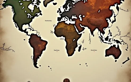 The Curious Cartography of Scent: Mapping Perfume Ingredients Through History
  The Curious Lexicon of Lost Trades
  The Surprisingly Consistent Science of Historical Ice Harvesting – A Frozen History of Commerce & Preservation
  The Unexpectedly Consistent Science of Historical Buttonhooks – Fashion, Function & Forgotten Tools