Board games. For many, they conjure warm memories of family nights, friendly competition, and rainy day entertainment. But beyond the gameplay itself lies a fascinating, often overlooked element: the packaging. Vintage board game boxes aren’t simply containers; they’re time capsules, meticulously crafted to attract buyers, reflect the cultural anxieties and aspirations of their era, and even subtly influence the experience *within* the box. This article will delve into the surprisingly consistent science behind vintage board game packaging – the art, the marketing, and the cultural reflection all rolled into one delightful, cardboard package.
The Early Days: Lithography & The Rise of Mass Production (Late 19th – Early 20th Century)
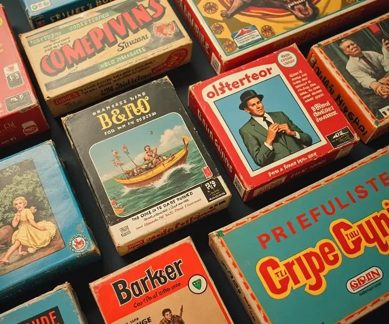
The very first commercially produced board games, emerging in the late 19th century, were relatively simple affairs. However, even these early examples demonstrate an understanding of the power of visual appeal. Before offset printing, lithography reigned supreme. Lithographic printing allowed for vibrant colors and detailed illustrations, crucial for attracting attention in a burgeoning marketplace. Companies like McLoughlin Bros. and Milton Bradley quickly became pioneers. Their boxes weren’t just functional; they were miniature works of art, often showcasing idyllic scenes – pastoral landscapes, charming children, and patriotic imagery.
These early boxes served several key purposes. Firstly, they needed to communicate the *concept* of the game. Without the benefit of television commercials or internet marketing, the box art was the primary advertising. Secondly, the quality of the box itself signaled the quality of the contents. A sturdy, beautifully illustrated box implied a well-made, worthwhile game. Finally, the imagery often reinforced prevailing social values – promoting family togetherness, moral lessons, or national pride.
The Golden Age of Board Games & The Influence of Illustration Styles (1930s – 1960s)
The period between the 1930s and the 1960s represents the ‘Golden Age’ of board games. This era saw the rise of iconic games like Monopoly, Scrabble, and Clue, and with them, a corresponding evolution in packaging design. The influence of various artistic movements is readily apparent. The 1930s, still reeling from the Great Depression, saw a trend towards escapism. Game boxes from this period often featured bright, optimistic imagery – glamorous travel destinations, exotic locales, and scenes of wealth and leisure. This wasn’t necessarily a reflection of reality, but a deliberate attempt to offer consumers a temporary respite from hardship.
The war years (1940s) saw a shift. Patriotic themes dominated, with games often centered around military strategy or wartime themes. Box art featured heroic soldiers, triumphant flags, and depictions of national unity. Even games not directly related to war adopted a more serious, pragmatic tone. Post-war, the 1950s brought a surge in consumerism and a renewed focus on the American Dream. Game boxes reflected this, showcasing suburban life, happy families, and material possessions. Illustrators like Reynold Leydecker and Gil Elvgren, known for their pin-up art, influenced the style of many board game boxes, emphasizing idealized beauty and domestic bliss.
The 1960s brought a wave of cultural change, and board game packaging began to reflect this. Pop Art influences became apparent, with bolder colors, graphic patterns, and a more playful aesthetic. Games aimed at teenagers and young adults often featured more contemporary imagery, reflecting the burgeoning youth culture.
Marketing Psychology & The Art of Persuasion
Beyond aesthetics, vintage board game packaging employed a sophisticated understanding of marketing psychology. Color psychology played a crucial role. Bright, warm colors like red and yellow were used to create excitement and energy, while cooler colors like blue and green conveyed trust and reliability. The use of fonts also mattered. Bold, eye-catching fonts were used for game titles, while more readable fonts were employed for instructions and other text.
The arrangement of elements on the box was carefully considered. The game title was typically placed prominently, often in the center of the box. Illustrations were strategically positioned to draw the eye and convey the game’s central theme. Often, a small “action shot” of the game in play would be included, demonstrating the fun and excitement that awaited the purchaser.
Testimonials and endorsements, though less common on vintage boxes than on modern packaging, were sometimes used to build credibility. The inclusion of awards or recognition from reputable organizations also served to enhance the game’s perceived value. Furthermore, the *shape* of the box itself could be a marketing tool. Unusually shaped boxes were designed to stand out on crowded store shelves and capture attention.
The Materials & Manufacturing: A Reflection of Technological Advancement
The materials used in board game packaging also evolved over time, reflecting advancements in manufacturing technology. Early boxes were typically made from thick cardboard, often covered in paper or cloth. The quality of the cardboard varied, with more expensive games using higher-grade materials. As the 20th century progressed, corrugated cardboard became increasingly common, offering greater strength and durability.
The printing process itself also underwent significant changes. Lithography gradually gave way to offset printing, which allowed for faster production and lower costs. The introduction of color printing techniques, such as four-color process printing, enabled more realistic and vibrant illustrations. The use of varnishes and laminates added a protective layer to the box, enhancing its appearance and extending its lifespan. The choice of materials and manufacturing processes wasn’t solely about cost; it also reflected a company’s commitment to quality and its target market. A premium game would likely be packaged in a more durable, aesthetically pleasing box.
Cultural Reflection: What Do the Boxes Tell Us?
Vintage board game boxes are invaluable historical artifacts. They offer a unique window into the cultural values, social anxieties, and popular trends of their time. Consider the depiction of gender roles. Early game boxes often portrayed women in traditional domestic roles, while men were depicted as adventurers, explorers, or business leaders. Over time, this began to change, reflecting the growing role of women in society.
The representation of different ethnicities and cultures also evolved. Early game boxes often featured stereotypical or inaccurate depictions of non-Western cultures. As the 20th century progressed, there was a growing awareness of cultural sensitivity, and game boxes began to portray different cultures with more respect and accuracy. The themes of the games themselves also reflected cultural anxieties and aspirations. Games about finance and wealth, like Monopoly, tapped into the American Dream, while games about exploration and adventure appealed to a sense of national pride and ambition.
Furthermore, the packaging often reveals subtle clues about the prevailing social norms of the time. The depiction of clothing, hairstyles, and home decor provides valuable insights into the lifestyles of people during different eras. Even the language used on the box can be revealing, reflecting the slang and idioms of the time. For a deeper dive into the science of objects and their historical context, consider exploring the science of antique sundials: understanding how time itself was perceived and measured.
The Transition to Modern Packaging & The Legacy of Vintage Design
The latter half of the 20th century saw a gradual transition towards modern packaging techniques. Plastic packaging became increasingly common, offering greater durability and protection. The rise of point-of-sale marketing led to a greater emphasis on eye-catching displays and promotional materials. Computer-aided design (CAD) and digital printing technologies revolutionized the packaging design process, allowing for greater flexibility and customization.
However, despite these changes, the fundamental principles of effective packaging design remain the same. A well-designed package still needs to attract attention, communicate the product’s benefits, and create a positive brand image. In many ways, modern packaging designers continue to draw inspiration from the vintage designs of the past. The bold colors, striking illustrations, and nostalgic imagery of vintage board game boxes have a timeless appeal that continues to resonate with consumers today.
Case Studies: Iconic Boxes & Their Stories
Monopoly (Parker Brothers)
The Monopoly box, particularly the early editions, is a masterclass in aspirational marketing. The imagery of wealth, luxury real estate, and financial success perfectly captured the American Dream during the Great Depression. The illustrations, often featuring detailed depictions of iconic properties, created a sense of desirability and excitement.
Clue (Hasbro)
The Clue (or Cluedo, in some regions) box is renowned for its atmospheric and mysterious imagery. The depiction of Tudor Mansion, with its shadowy corridors and hidden secrets, perfectly conveyed the game’s theme of murder and intrigue. The color palette, dominated by dark reds and greens, created a sense of suspense and foreboding.
Risk (Parker Brothers)
The Risk box, with its map of the world and depictions of armies in battle, immediately communicated the game’s theme of global domination. The use of bold colors and dynamic illustrations created a sense of urgency and conflict. The box design effectively conveyed the game’s strategic complexity and its appeal to players who enjoyed military strategy.
Collecting Vintage Board Game Boxes: Preservation & Appreciation
Collecting vintage board game boxes is a growing hobby, driven by a desire to preserve these unique cultural artifacts. Collectors value boxes in good condition, with original artwork and minimal wear and tear. Rare and limited-edition boxes are particularly sought after. Proper storage and handling are essential to prevent damage and preserve the box’s value.
The act of collecting isn’t simply about acquiring objects; it’s about connecting with the past and appreciating the artistry and craftsmanship of bygone eras. It’s about understanding the stories behind the boxes and the cultural context in which they were created. If you enjoy uncovering the secrets hidden within objects, you might also find the history of antique lockpicking tools fascinating: a surprisingly technical and artistic field. The careful study of these objects can tell us much about the societies that created them.
Beyond the Box: The Interconnectedness of Design
The science of board game packaging doesn’t exist in a vacuum. It’s interconnected with other areas of design, such as graphic design, illustration, and marketing. Furthermore, it reflects broader cultural trends and historical events. Understanding the principles of vintage board game packaging can provide valuable insights into the history of design and the evolution of consumer culture.
Just as the design of a vintage postcard can reveal social commentary, the seemingly simple act of sending a greeting becomes a historical record. Similarly, the rigid structure and social engineering of historical boarding schools can be seen reflected in their rules and rituals: a fascinating study in social control. Even the somber elegance of Victorian mourning crepe reveals a complex system of social expectations and emotional expression: a poignant reflection of societal attitudes toward death.
In conclusion, the seemingly simple act of designing a board game box is a complex and multifaceted process, informed by art, marketing, and cultural reflection. Vintage board game boxes are more than just containers; they’re time capsules, offering a unique glimpse into the past and a testament to the enduring power of design.

 The Surprisingly Consistent Symbolism of Antique Fans – Language, Status & Victorian Courtship
  The Surprisingly Consistent Science of Vintage Perfume Formulation – Beyond Scent, a History of Chemistry
  The Surprisingly Consistent Evolution of Board Game Pieces – From Pawns to Plastic, a History of Playful Figures
  The Unexpectedly Precise History of Shadow Puppetry: Origins, Techniques & Cultural Tales
  The Curious Evolution of Board Games: From Senet to Settlers