We often think of handwriting as a personal, almost idiosyncratic expression. A quick scribble, a flowing cursive, a precise print – all seem uniquely ours. But beneath the apparent variability lies a surprisingly consistent science. Penmanship, far from being merely aesthetic, has been shaped by ergonomics, psychology, technological constraints, and even the materials used to write. This article explores the historical development of penmanship styles, revealing the underlying principles that have guided their evolution and the reasons for their enduring presence.
The Precursors to Style: From Cave Walls to Quill Pens
Before considering ‘styles’ as such, it’s crucial to acknowledge the origins of writing itself. Early forms of written communication, like cave paintings and hieroglyphs, were primarily representational – pictures conveying meaning. The move towards abstraction, and then towards alphabets, was a gradual process. The earliest alphabets, like the Phoenician alphabet, were remarkably simple, designed for efficiency rather than beauty. However, the medium heavily influenced the form. Writing on clay tablets with a stylus demanded wedge-shaped impressions (cuneiform), while painting on papyrus with reeds encouraged linear strokes.
The real turning point came with the development of the quill pen in the 6th century AD. Quill pens, made from bird feathers, offered a degree of flexibility and control previously unavailable. This newfound capability sparked experimentation and, consequently, the beginnings of distinct handwriting styles. The very nature of the quill – its need for frequent re-dipping in ink, its varying flexibility, and the angle at which it was held – dictated certain characteristics that would persist for centuries.
Medieval Hands: The Birth of Formal Scripts
The Middle Ages saw the flourishing of monastic scriptoria, where scribes painstakingly copied manuscripts. These scribes weren’t simply replicating text; they were creating works of art. Several distinct scripts emerged, each serving a specific purpose.
- Carolingian Minuscule (c. 8th-12th centuries): Developed during the reign of Charlemagne, this script was designed for clarity and readability. Its rounded forms and consistent letter heights made it ideal for mass production of texts, and it became the foundation for many modern lowercase letterforms.
- Gothic Script (c. 12th-15th centuries): Also known as Blackletter, this script is characterized by its angular, dense, and often highly ornamented forms. It was favored in Northern Europe and became associated with religious and legal documents. While visually striking, Gothic script was relatively difficult to read quickly.
- Humanist Minuscule (c. 15th century): Developed by Italian humanists as a reaction against the perceived harshness of Gothic script, Humanist Minuscule drew inspiration from Carolingian Minuscule. It was more open and legible, and it became the basis for many modern Roman typefaces.
These scripts weren’t arbitrary choices. They were developed with specific goals in mind: legibility for long hours of reading, durability for frequent handling, and a visual aesthetic that reflected the importance of the text. The constraints of the quill pen – the pressure required to create thick and thin lines, the need for consistent ink flow – also influenced the forms of the letters. This period demonstrates how practical needs and aesthetic preferences can intertwine to shape a writing style.
The Renaissance and the Rise of Italic Script
The Renaissance witnessed a renewed interest in classical learning and a corresponding desire for elegant and legible handwriting. This led to the development of Italic script, a flowing, cursive style based on Humanist Minuscule. Italic script was faster to write than its predecessors, making it well-suited for secretaries and scholars. Its graceful forms and rhythmic flow contributed to its widespread popularity.
The invention of the printing press in the mid-15th century had a profound impact on penmanship. Printers sought to emulate the beauty and legibility of manuscript handwriting in their typefaces, and Italic typefaces became particularly popular. This created a feedback loop, as printed examples of Italic script influenced handwritten styles, and vice versa.
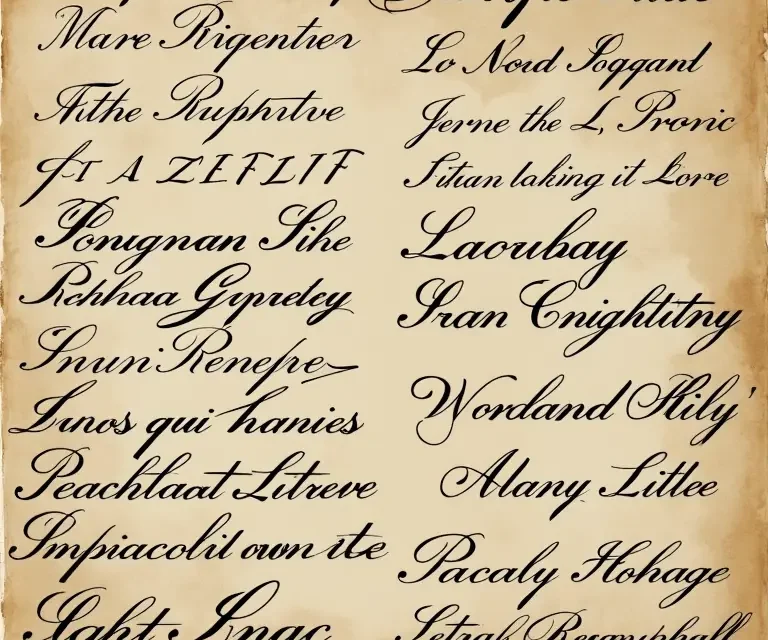
The Copperplate Era: Precision and Ornamentation
The 18th and 19th centuries saw the rise of Copperplate script, a highly refined and ornamented style that became the standard for formal handwriting. Copperplate was named after the copper plates used in engraving, and it was characterized by its precise lines, elegant curves, and dramatic contrast between thick and thin strokes. This style was often taught using a pointed steel pen, which allowed for even greater control and precision than a quill.
The key to Copperplate lies in its systematic application of pressure and angle. The pointed pen creates thick downstrokes when pressed firmly and thin upstrokes when held lightly. The angle of the pen is also crucial for achieving the characteristic slant and consistent letterforms. Mastering Copperplate required years of dedicated practice, and it became a mark of education and refinement.
Spencerian Script and the American Influence
In the mid-19th century, Platt Rogers Spencer developed Spencerian script, an American adaptation of Copperplate. Spencerian script was designed to be even more flowing and rhythmic than Copperplate, and it emphasized graceful curves and elegant flourishes. It became hugely popular in the United States, taught in schools and used for business correspondence. Spencerian script was seen as a symbol of American identity and a testament to the nation’s emphasis on practicality and efficiency.
Spencerian script differs from Copperplate in several key ways. It features more rounded letterforms, a more pronounced slant, and a greater emphasis on connecting strokes. The overall effect is a more relaxed and natural-looking style. However, like Copperplate, Spencerian script required significant skill and practice to master.
The Rise of Business Writing and the Decline of Flourishes
The late 19th and early 20th centuries saw a shift in the demands placed on handwriting. The growth of commerce and the increasing volume of correspondence led to a need for faster, more efficient handwriting styles. The elaborate flourishes of Copperplate and Spencerian script were seen as time-consuming and unnecessary.
As a result, simplified and more practical handwriting styles began to emerge. The Palmer Method, developed by Austin Palmer, became the dominant handwriting style in American schools in the early 20th century. The Palmer Method emphasized arm movement rather than finger movement, promoting speed and legibility. It also simplified letterforms and eliminated many of the flourishes that characterized earlier styles. This emphasis on efficiency reflected the changing priorities of the modern era. This period also saw the increasing popularity of typewriters, which further diminished the importance of elaborate penmanship.
Modern Styles: Print, Cursive, and the Digital Age
Today, handwriting styles are more diverse than ever before. Print handwriting, characterized by discrete, unconnected letters, is often taught in schools. Cursive handwriting, with its connecting strokes, remains popular, although its use is declining. The advent of computers and smartphones has led to a significant decrease in handwriting overall.
However, even in the digital age, handwriting retains a unique appeal. Studies have shown that writing by hand can enhance memory, creativity, and cognitive development. The tactile experience of writing with a pen or pencil engages different parts of the brain than typing on a keyboard.
Interestingly, even modern handwriting styles still bear the imprint of their historical predecessors. The basic shapes of our letters – the loops, curves, and angles – are rooted in the scripts of the past. The principles of legibility and ergonomics that guided the development of those scripts continue to influence our handwriting today.
The Science Beneath the Flourishes: A Deeper Look
The consistency across penmanship styles isn’t accidental. Several underlying scientific principles contribute to readability and efficiency.
- Gestalt Principles: The way we perceive visual information plays a role. Letters are grouped and recognized based on their overall form, not just individual strokes. Styles that adhere to these principles (proximity, similarity, closure) are easier to read.
- Motor Control: The movements required to form letters are influenced by the biomechanics of the hand and arm. Styles that minimize strain and maximize fluidity are more comfortable and efficient to write.
- Visual Discrimination: Distinct letterforms are essential for avoiding confusion. Styles that clearly differentiate between similar letters (e.g., ‘b’ and ‘d’) improve readability.
- Cognitive Load: Complex or overly ornamented styles can increase the cognitive effort required to read and write. Simpler styles reduce this load, making communication more efficient.
These principles explain why certain features consistently appear in successful handwriting styles – consistent letter heights, clear letterforms, and a rhythmic flow. They also explain why styles that deviate too far from these principles tend to be difficult to read and write.
The Future of Penmanship
While the future of handwriting may seem uncertain, it’s unlikely to disappear entirely. The unique benefits of handwriting – its cognitive benefits, its expressive potential, and its personal touch – will ensure its continued relevance. Furthermore, there’s a growing interest in calligraphy and hand lettering, demonstrating a renewed appreciation for the art of beautiful writing.
As technology continues to evolve, we may see new forms of penmanship emerge, adapted to digital interfaces and new writing tools. However, the underlying principles of legibility, ergonomics, and aesthetics will likely remain constant. The history of penmanship is a testament to the enduring human need to communicate, to express ourselves, and to create beauty through the written word.
Interested in other areas where traditional practices have a surprising scientific basis? Explore the consistent logic of traditional herbal remedies, the science behind soapmaking, the surprising consistency in early map projections, or the surprisingly consistent science of ink formulation. You might also enjoy learning about the science of clock chimes.

 The Curious Acoustics of Historical Echo Chambers: Resonance, Ritual, and Revelation
  The Curious Cartography of Scent: Mapping Perfume Ingredients Through History
  The Curious Lexicon of Lost Trades
  The Surprisingly Consistent Science of Historical Ice Harvesting – A Frozen History of Commerce & Preservation
  The Unexpectedly Consistent Science of Historical Buttonhooks – Fashion, Function & Forgotten Tools
  The Surprisingly Consistent Science of Historical Toy Soldiers – Miniature Warfare, Materials & Collective Play