The humble postcard. Often dismissed as a fleeting souvenir, a trivial memento, or a relic of a bygone era, the postcard is, in reality, a remarkably rich and complex artifact. Beyond the picturesque scenes and cheerful greetings, vintage postcards offer a unique window into the social, cultural, and artistic sensibilities of their time. But it’s not merely a reflection; it’s a carefully constructed communication, governed by surprisingly consistent design principles, evolving aesthetic trends, and even subtle forms of social commentary. This article will delve into the unexpectedly consistent science of vintage postcard design, exploring its history, artistic elements, and the social forces that shaped this fascinating medium.
The Dawn of the Postcard: A Technological and Social Revolution
While precursors to the postcard existed – notably picture cards used as visiting cards in the 19th century – the modern postcard as we know it emerged in the late 1860s and 1870s. Initially, postcards were simply official postal cards issued by governments. These early cards were unillustrated, intended primarily for short messages. The real revolution began when private printers were allowed to produce postcards in 1871. This opened the floodgates for artistic expression and commercial exploitation. The cost was low, the convenience undeniable, and suddenly, sending a visual message became accessible to the masses. The rise of the postcard coincided with improvements in printing technology – particularly chromolithography – which allowed for the mass production of vibrant, full-color images.
The postcard’s popularity wasn’t simply about convenience or affordability. It reflected a changing social landscape. Increased literacy rates, a growing middle class with disposable income, and improvements in postal services all contributed. Furthermore, the postcard filled a social need for quick, informal communication. It was quicker and cheaper than a letter, and the image provided a visual element that letters lacked. This new form of communication fostered a sense of connectedness and allowed people to share experiences, even from afar.
The Golden Age: Artistic Styles and Design Elements (1890s-1914)
The period between the 1890s and the outbreak of World War I is often considered the “Golden Age” of postcards. This era witnessed an explosion of artistic styles and design innovation. Several key movements influenced postcard design:
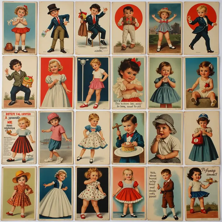
- Art Nouveau: Characterized by flowing lines, organic forms, and intricate details, Art Nouveau postcards often featured depictions of women, flowers, and fantastical creatures. The emphasis was on elegance and aesthetic beauty.
- Impressionism & Post-Impressionism: Though less directly translated, the techniques of these painting movements – emphasizing light, color, and subjective perception – found their way into postcard imagery. Landscapes and cityscapes were often rendered with a softer, more atmospheric quality.
- Realism & Photorealism: As photography became more accessible, photographic postcards gained popularity. These cards offered a seemingly objective representation of places and events, though even these were often carefully staged and manipulated.
- Chromolithography’s Influence: The dominant printing method, chromolithography, allowed for the creation of brilliantly colored images. However, it also imposed certain constraints. Artists had to design with the limitations of the process in mind, often using bold colors and simplified forms.
Beyond the overarching artistic styles, certain design elements were consistently employed:
- Composition: Postcards typically followed a clear compositional structure. A dominant focal point, balanced with surrounding elements. Diagonal lines were often used to create a sense of depth and movement.
- Color Palette: The color palettes varied depending on the style, but generally, postcards favored bright, saturated colors. The use of contrasting colors was common to draw the eye and create visual interest.
- Typography: The font used for the message side was often simple and legible. The font on the picture side, if any, was chosen to complement the overall design. Elaborate lettering was common in Art Nouveau postcards.
- Border Design: Borders were frequently used to frame the image and add a decorative element. These could range from simple lines to intricate floral patterns.
The Pictorial Turn: Representing Place and Identity
A significant aspect of postcard design was its role in representing place and shaping identity. Postcards weren’t simply visual records of locations; they were carefully curated representations designed to evoke specific emotions and perceptions.
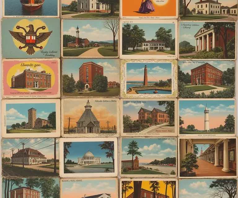
Tourism and the Idealized Landscape: Postcards played a crucial role in promoting tourism. The images presented were often idealized, showcasing the most attractive aspects of a destination. Mountains were higher, beaches were whiter, and cities were cleaner than reality often allowed. This created a desire to visit and experience these “postcard perfect” locations.
National Identity and Propaganda: Postcards were also used to promote national identity and, increasingly, to serve as a form of propaganda. During times of political tension, postcards often depicted patriotic scenes, glorified military achievements, and demonized enemy nations. The Franco-Prussian War (1870-1871) and the lead-up to World War I saw a surge in patriotic postcard production.
Social Commentary and Satire: Not all postcards were simply celebratory or propagandistic. Many artists used the medium to offer social commentary and satire. Postcards poked fun at societal norms, criticized political figures, and exposed social inequalities. These satirical postcards often used humor and irony to convey their message.
The Interwar Years & Beyond: Shifting Styles and Technological Advancements
The period following World War I brought significant changes to postcard design. The shock of the war led to a rejection of the ornate styles of the Art Nouveau era in favor of more streamlined and modern aesthetics.
- Art Deco: Characterized by geometric shapes, bold colors, and luxurious materials, Art Deco postcards reflected the optimism and modernity of the 1920s and 1930s.
- Photomechanical Printing: Improvements in photomechanical printing allowed for the reproduction of photographs with greater accuracy and detail. This led to a further increase in the popularity of photographic postcards.
- Collage and Montage: Artists began experimenting with collage and montage techniques, creating visually dynamic and often surreal images.
- The Rise of Linen Postcards: In the 1930s, “linen” postcards – printed on a textured paper stock – became popular. These cards often featured vibrant, hand-tinted colors and a distinctive retro aesthetic.
The Second World War again impacted postcard production, with many cards used for propaganda and morale boosting. After the war, postcard design continued to evolve, influenced by trends in graphic design and advertising. The rise of color photography and offset printing led to a decline in the use of chromolithography. The postcard, while still popular, began to lose its prominence as a primary form of communication with the advent of the telephone and, later, email.
The Science of Appeal: Psychology and Visual Communication
Underlying the artistic trends and historical context is a surprisingly consistent science to the appeal of vintage postcards. This relates directly to principles of psychology and visual communication. Certain elements consistently draw the eye and evoke emotional responses:
- Rule of Thirds: The composition of many successful postcards adhered to the rule of thirds, placing key elements along imaginary lines that divide the image into nine equal parts. This creates a more balanced and visually engaging composition.
- Color Psychology: The use of specific colors was deliberate. Blue often evoked feelings of tranquility and peace, while red conveyed excitement and passion.
- Gestalt Principles: The principles of Gestalt psychology – such as proximity, similarity, and closure – were often employed to create visual coherence and guide the viewer’s eye.
- Narrative & Storytelling: The most successful postcards told a story, even if it was a simple one. They captured a moment in time, evoked a sense of place, or conveyed a specific emotion.
This wasn’t necessarily a conscious application of psychological principles by the artists; rather, it was a result of an intuitive understanding of what resonated with audiences. They understood, at a subconscious level, how to use visual elements to create a compelling and memorable image.
Collecting and Preserving the Legacy
Today, vintage postcards are highly collectible, prized for their artistic merit, historical significance, and social commentary. Collectors are drawn to a wide range of themes, including topographical views, humorous cards, holiday greetings, and political satire. The market for vintage postcards is thriving, with cards fetching significant prices depending on their rarity, condition, and subject matter.
Preserving these fragile artifacts is crucial. Proper storage in acid-free sleeves and albums, away from direct sunlight and humidity, is essential to prevent deterioration. Digitization efforts are also underway to create online archives of vintage postcards, making them accessible to a wider audience.
Conclusion: More Than Just a Greeting
The vintage postcard is far more than just a simple greeting card. It’s a tangible link to the past, a visual record of changing times, and a testament to the power of art and communication. The surprisingly consistent science behind its design – rooted in artistic principles, psychological understanding, and social forces – reveals a depth and complexity that belies its humble form. By studying these miniature works of art, we gain a deeper appreciation for the history, culture, and aesthetic sensibilities of generations past. The postcard continues to resonate, reminding us of a time when connection was fostered through carefully chosen images and handwritten messages.
Further exploration of related historical technologies can be found by examining antique lockpicking tools, or the evolution of vintage spectacle frames. Similarly, the cultural context of mourning can be explored through Victorian mourning crepe, while artistic meteorological indicators are discussed in historical weather vanes. To understand how locations are named and the stories they hold, read about the etymology of place names.